Entry · Ref KP541FKZ
Why Local Businesses Need Mobile Optimisation Services for a Competitive Edge
- Posted
- 2026-11-03
- Last amended
- 2026-11-03
- Account
- @themobileoptimisationservices
When I first started working with small businesses in Lancashire, many owners assumed that having a website was enough. They had invested in a design, picked colours that matched their brand, and listed their services. But when I pulled up their sites on my phone, the experience was often frustrating. Text overflowed the screen. Buttons were too small to tap. The page took so long to load that I gave up and moved on. That moment always led to the same conversation: mobile optimisation services are not an extra feature. They are the foundation of a functional website.
It took me a while to understand why so many business owners overlook this. Running a shop, a trades business, or a local service in a place like Burnley or Blackburn leaves little time for technical web details. But the truth is that mobile traffic now accounts for more than half of all web visits, and that number keeps climbing. If your site does not work well on a phone, you are losing real opportunities.
What Mobile Optimisation Services Actually Do
Mobile optimisation services cover a range of technical tasks that make a website load faster, display properly, and function smoothly on smartphones and tablets. It is not just about shrinking the desktop version. It involves rethinking how the site behaves on a smaller screen with a slower connection and touch-based navigation.
One of the first things I check is responsive design. This means the site layout adapts fluidly to different screen sizes. A good responsive design stacks content vertically, resizes images, and makes navigation menus thumb-friendly. Without it, users have to pinch and zoom, which most people simply will not do.
But responsive design alone is not enough. Speed is the other half of the equation. Tools like Google PageSpeed Insights and GTmetrix give a clear picture of how fast a page loads on mobile. I have seen sites that scored in the red for mobile performance even though they looked fine on a desktop. The culprits are usually large images, unminified code, and scripts that block the page from rendering.

Core Web Vitals and Real-World Performance
Google introduced core web vitals as a set of metrics that measure user experience: loading performance, interactivity, and visual stability. These are not abstract numbers. They affect how your site ranks in search results. If your mobile pages load slowly or jump around while rendering, you will lose both visitors and search visibility.
One practical fix is image compression. A high-resolution photo that looks great on a 27-inch monitor can slow a mobile page to a crawl. Compressing images without losing visible quality often cuts file size by half or more. Another technique is lazy loading, where images and videos load only as the user scrolls down. That way, the initial page load stays fast.
CSS minification is another step I regularly apply. Removing unnecessary spaces, comments, and characters from stylesheets reduces file size and speeds up rendering. Similarly, JavaScript deferral moves scripts that are not critical to load after the main content. This prevents scripts from blocking the page from displaying.
Server response time also matters. If your hosting is slow, no amount of front-end optimisation will fix it. A good CDN (content delivery network) can help by serving files from a server closer to the user. For a Lancashire business serving local customers, a CDN might not always be necessary, but for any site that uses images or large assets, it can make a noticeable difference.
Mobile-First Indexing and Local SEO
Google now uses mobile-first indexing for most websites. That means it looks at the mobile version of your site first when deciding how to rank it. If your mobile pages are slow or poorly formatted, your rankings can drop, even if your desktop site is excellent. This is where mobile optimisation services and local SEO overlap. For Lancashire businesses that rely on local search traffic, a mobile-friendly site is not optional.
I have worked with a number of local service providers who were puzzled by their poor search rankings. Their desktop site looked fine, but their mobile version was a mess. After we ran the Google Mobile-Friendly Test, the issues were clear: text too small to read, viewport not set, content wider than the screen. Fixing those issues improved their local rankings within weeks.
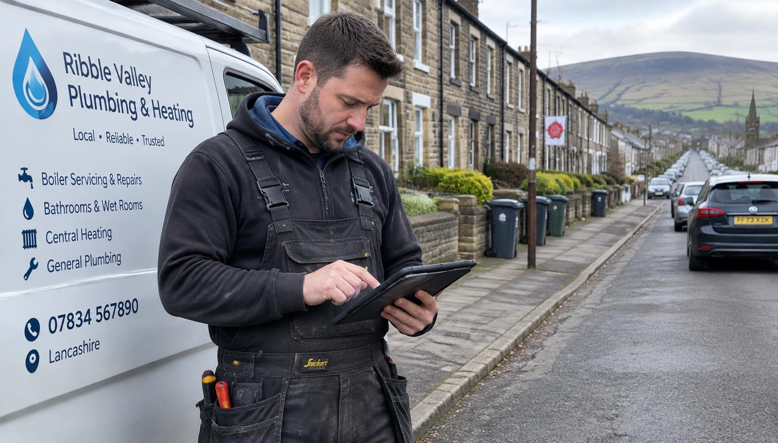
Bounce rate is another metric that improves with proper optimisation. If a visitor lands on your mobile site and it takes more than three seconds to load, most will leave. That spike in bounce rate tells Google that your page is not satisfying the user. Lowering load time keeps people on the page longer and improves your chances of conversion. For a local bakery or a plumbing company, a few seconds of delay can mean a lost customer.
AMP and Accelerated Mobile Pages
AMP (accelerated mobile pages) is a framework designed to make pages load almost instantly on mobile devices. It strips down HTML, limits CSS and JavaScript, and caches pages on Google's servers. For content-heavy sites like news or blogs, AMP can be very effective. But it is not a perfect fit for every business. The trade-off is that AMP restricts styling and interactive elements. For a simple landing page or a service page, it can work well. For an e-commerce site with complex filtering and product images, it might be too limiting.
I have used AMP on a few local projects where the client wanted a fast, clean mobile experience for their blog and service pages. But I always test first. Not every site benefits from the same approach. Sometimes a well-optimised responsive site with good hosting and image compression will outperform an AMP version.
Making It Practical for Lancashire Businesses
The best mobile optimisation services are the ones that fit your specific situation. A restaurant in Burnley needs a menu that loads fast and allows easy tap-to-call. A construction company needs a portfolio that displays quickly on a site visit. An e-commerce store needs product pages that load in under two seconds and allow smooth checkout on a phone.
WordPress mobile plugins can help automate some of the optimisation. Plugins for caching, image optimisation, and lazy loading are widely available. But they require proper configuration. I have seen sites break because a plugin conflicted with the theme or with another plugin. Testing is essential.
Squarespace mobile templates are generally well-optimised out of the box, but they still benefit from customisation. If you use a template that is not designed for mobile, you may face layout issues or slow load times. The same applies to any CMS. The template is only the starting point.

Conversion rate optimisation is the ultimate goal. A fast, responsive mobile site that loads in under three seconds will convert more visitors into customers. Whether that means a phone call, a contact form submission, or an online purchase, the path to conversion must be frictionless. Every millisecond counts.
In my experience, the businesses that invest in mobile optimisation services see measurable improvements in both traffic and sales. It is not a one-time fix. As browsers and devices evolve, ongoing monitoring and adjustments are needed. But the return is real. For a small business in Lancashire, a well-optimised mobile site is often the difference between a customer choosing you or moving to a competitor.